Information Architecture, UX Research
UX Designer
April 2026
SFPL's website, the only front door many residents have to ten branches, buried its most-needed resources three or more levels deep behind inconsistent navigation. This case study covers the research, redesign, and validation that fixed it. Completed for Berkeley's UX certification, not a commissioned SFPL engagement, with design translation carried out independently. Scope runs from research through validated wireframes.
Buried Three or More Levels Deep

Same site, three navigation systems — "Support & Services" disappears into an "Educators & Parents" mega-menu on one version, then resurfaces as "Volunteer & Job Opportunities" on another.
Carlos and Sarah
Two personas with nearly nothing in common
Carlos, a recent immigrant from Colombia navigating the U.S. job market, needs ESL resources, career help, and a library card, but faces language and familiarity barriers. Sarah, a tech program manager who just relocated with her toddler, wants community and activities, with little patience for anything that isn't fast and easy to find. Their needs have almost nothing in common. Given SFPL's dual mandate as both a government-funded and community-supported institution, that's exactly what made the problem worth solving well.


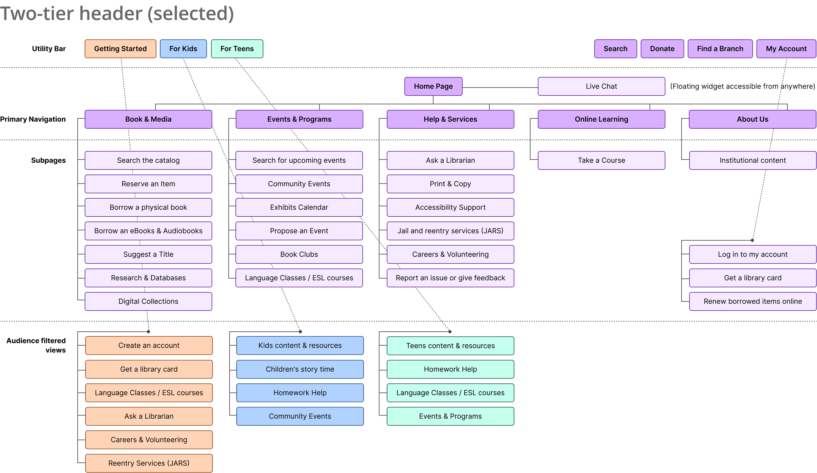

Home Page key design decisions
Two-tier header separates utility tools from primary navigation
Audience switchers, For Teens, For Kids, Getting Started, persistent in the primary nav
Language selector supports SFPL's multilingual user base
Persistent location banner provides quick access to branch info
Hero carousel leads with featured community content
Event cards include audience tags and branch filters
Footer reorganized into four sections: Explore, Help, About, Support

Getting Started key design decisions
Active nav state clearly indicates the current audience view
Trust signals address key barriers: free, fast, multilingual
Persistent Chat with a Librarian widget available on all pages
Page sections organized using a Category scheme, grouping entry-point services into a scrollable view

The Wireframes Confirm the IA Holds Up in an Actual Interface
The research translated cleanly, and audience-based entry points with plain-language labels are the most visible decisions on screen. Metadata, the fifth building block of information architecture, is only lightly represented here, and is an area to define more explicitly in future iterations.