Usability Study
Usability Study

Booking.com

Booking.com

High task completion, low satisfaction: unpacking a 3.4 / 5 CSAT

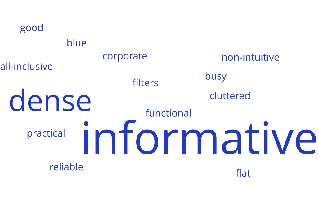
The gap between completion and satisfaction traced back to two things: reliance on external tools to judge location, and a density that reads as clutter. Benchmarked against platforms like Airbnb and Google Hotels, the experience was perceived as reliable and information-dense, but lacked visual clarity and hierarchy. Completed for Berkeley's UX certification, not a commissioned Booking.com engagement.

Focus:

Focus:

UX Research, Usability Testing

Role:

Role:

UX Researcher

Date:

Date:

November 2025

STUDY OVERVIEW

STUDY OVERVIEW

Objectives

  • Test the search and booking flow

  • Gauge perception of layout and design

  • Explore engagement with secondary features

Methodology

  • 5 moderated usability tests, remote

  • Post-task survey, scaled + open-ended

Participants

  • 5 total participants

  • Varied experience with Booking.com

  • Mixed tech comfort

Tasks

  • Book a hotel near a museum

  • Explore the site freely


POST-TASK SURVEY RATING

3.4

Users rated Booking.com 3.4 out of 5 compared to platforms like Airbnb and Google Hotels — reliable and information-rich, but softer on visual clarity.

Users rated Booking.com 3.4 out of 5 compared to platforms like Airbnb and Google Hotels — reliable and information-rich, but softer on visual clarity.

RESEARCH QUESTION

RESEARCH QUESTION

Clarity, Trust, Engagement

Where friction hides in a platform that already converts

Three objectives guided the work: how well people complete core tasks, how they perceive the layout and visual design, and how they interact with secondary features beyond booking a room. The goal was to uncover where friction shows up around clarity, trust, and engagement, even in a platform that already converts well.

METHOD

METHOD

Five Moderated Usability Tests

Two tasks, directed and organic behavior

Five moderated usability tests ran, followed by a post-task survey. Tasks included searching for and booking a hotel near a specific landmark, and freely exploring the site without a set goal, giving room to observe both directed and organic behavior.

Five moderated usability tests ran, followed by a post-task survey. Tasks included searching for and booking a hotel near a specific landmark, and freely exploring the site without a set goal, giving room to observe both directed and organic behavior.

A recorded session with Participant 4, one of five moderated usability tests.

A recorded session with Participant 4, one of five moderated usability tests.

FINDING 01

FINDING 01

Broken User Flow

Broken User Flow

Task completion relied on third-party tools

All participants successfully booked a hotel, confirming the core flow is intuitive. But 3 of 5 relied on external tools like Google Maps to judge proximity to landmarks before returning to Booking.com to complete the booking, indicating that native location-filtering and map tools fail to support the full decision-making flow.

All participants successfully booked a hotel, confirming the core flow is intuitive. But 3 of 5 relied on external tools like Google Maps to judge proximity to landmarks before returning to Booking.com to complete the booking, indicating that native location-filtering and map tools fail to support the full decision-making flow.

The flow 3 of 5 participants took: booking.com to google.com/maps and back to complete the booking.

The flow 3 of 5 participants took: booking.com to google.com/maps and back to complete the booking.

FINDING 02

FINDING 02

Dense and Cluttered

Dense and Cluttered

A hierarchy problem, not a content one

Participants described the design as functional and practical, but also dense and cluttered. This tension between information richness and cognitive load points to a visual hierarchy problem, rather than a content issue: the necessary information is present, but it isn't prioritized clearly enough for easy scanning. Against competitors like Airbnb and Google Hotels, this lack of visual clarity was directly reflected in the post-task rating.

Participants described the design as functional and practical, but also dense and cluttered. This tension between information richness and cognitive load points to a visual hierarchy problem, rather than a content issue: the necessary information is present, but it isn't prioritized clearly enough for easy scanning. Against competitors like Airbnb and Google Hotels, this lack of visual clarity was directly reflected in the post-task rating.

(1) Search bar, map, and result photo compete for attention. (2) Room specs, cancellation policy, and price stack with no separation. (3) The same density repeats across the full viewport — not one bad section.

(1) Search bar, map, and result photo compete for attention. (2) Room specs, cancellation policy, and price stack with no separation. (3) The same density repeats across the full viewport — not one bad section.

RECOMMENDATION

RECOMMENDATION

Severity-Mapped

Severity-Mapped

What already works, what ships first

Two of the study's three questions produced findings. Trust had the only high-severity issue: the map, which sent users to Google Maps to confirm what the site should answer itself. Clarity surfaced three moderate issues (an unexplained "No Results" state, an unclear sort order, and underused reviews) that share one cause, density and ranking logic that are hard to read. Engagement produced nothing actionable. The search bar and price filters already work, so they stay as they are.

Two of the study's three questions produced findings. Trust had the only high-severity issue: the map, which sent users to Google Maps to confirm what the site should answer itself. Clarity surfaced three moderate issues (an unexplained "No Results" state, an unclear sort order, and underused reviews) that share one cause, density and ranking logic that are hard to read. Engagement produced nothing actionable. The search bar and price filters already work, so they stay as they are.

Completion Isn't the Same as Confidence
What this study actually proves


Every task got completed: completion was never the open question; clarity, trust, and engagement were. A platform can convert reliably and still lose confidence in moments completion can't measure: trusting a map result, scanning a dense page, judging how listings are ranked. Two of those three questions held up; that's where Booking.com's 3.4-of-5 sits below more visually confident competitors, and where the fix belongs: location trust and results-page clarity, not new features.

Design systems, UX, and the judgment that connects them. Let's talk.

© 2026 Leon Os Design

Design systems, UX, and the judgment that connects them. Let's talk.

© 2026 Leon Os Design

Design systems, UX, and the judgment that connects them. Let's talk.

© 2026 Leon Os Design